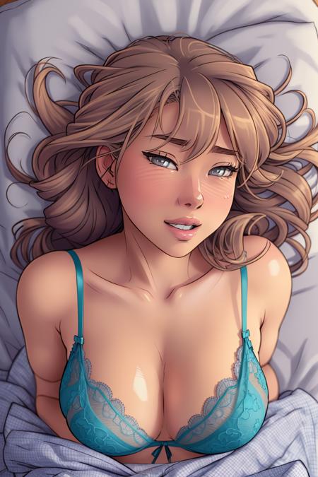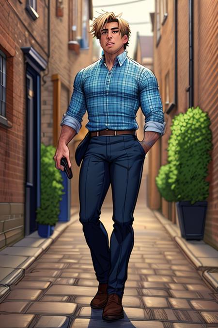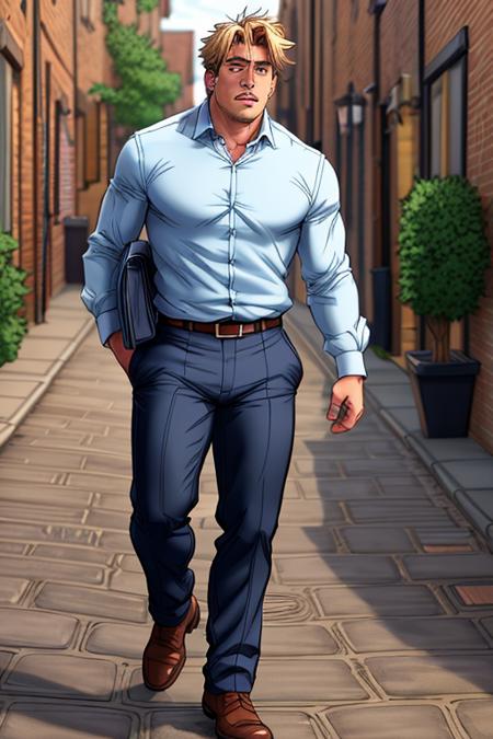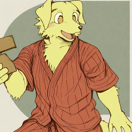
I don't think I do a good job with styles. I do something wrong in the text or data set choices, or maybe I just don't use enough consistent images. This was done with circa 100 consistent styled images.
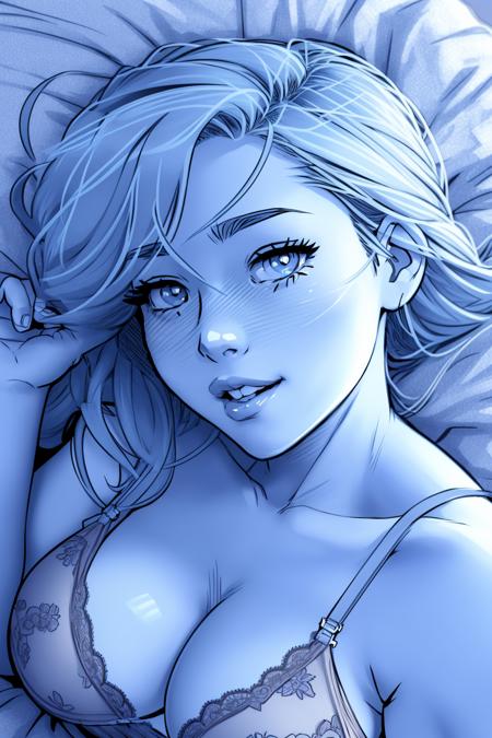
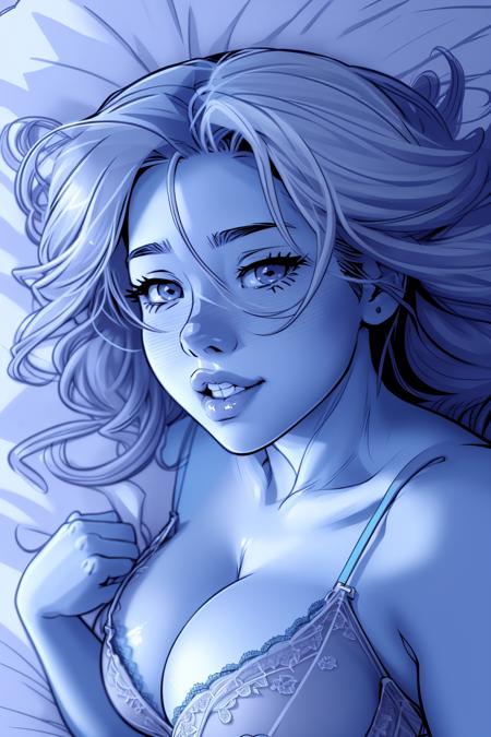
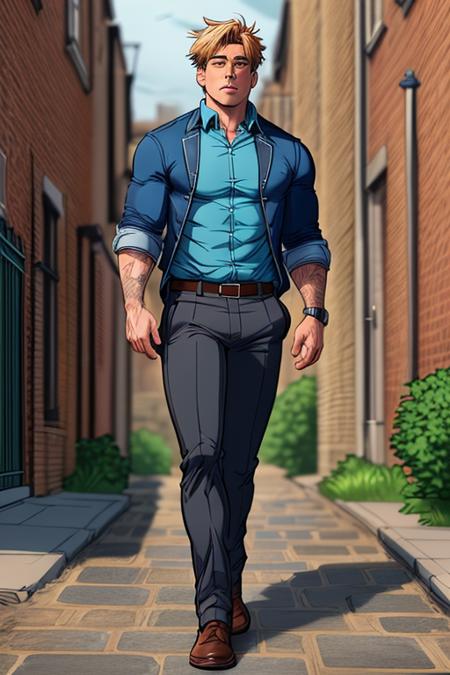
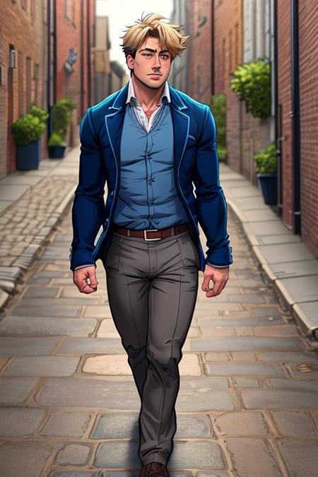
This one has a strange love of the colour blue which you will see in the grid image and previews. Randomly some images just love to turn up in a blue monotone and I really can't understand that as nothing in the dataset looked close to this. Strangely I kind of like it but I haven't figured the negative prompt necessary to stop it, but I would love to control it more as I think this could work will if you can dictate the colour or gradient of the effect.
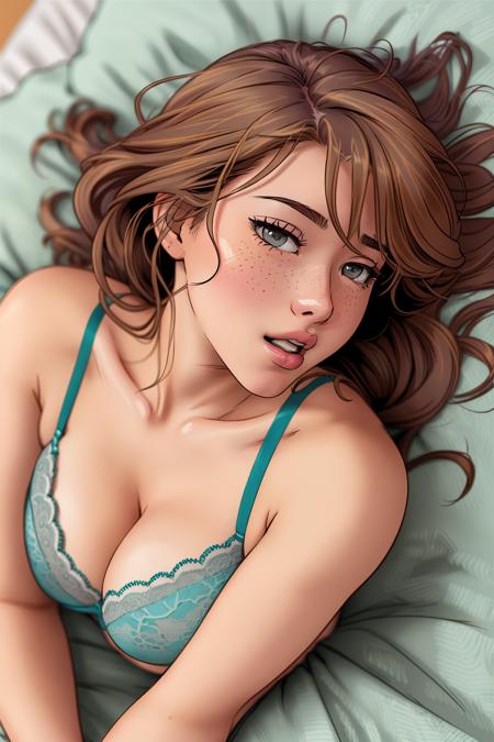
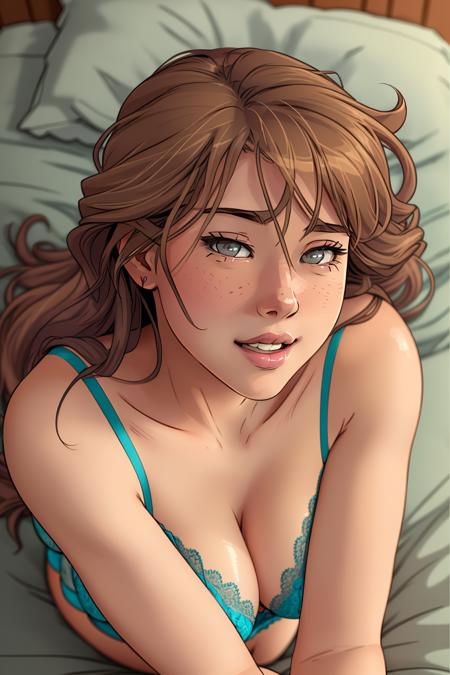
the sweet spot seems to be around 0.8 I think, and the results vary massively depending on the model you use. I have found the Babes checkpoint to produce best results, as it is complementary to the art style regardless.
描述:
训练词语: DEN_MelkorMancin_Artsyle
名称: DEN_MelkorMancin_Artsyle.pt
大小 (KB): 7
类型: Model
Pickle 扫描结果: Success
Pickle 扫描信息: No Pickle imports
病毒扫描结果: Success